
This is in continuation of the previous blog on “BI also as a Decision Measurement System (DMS)”. We saw in the previous blog that BI as a decision measurement system is something the CXOs would like to see. As a DMS, I would like to see how a particular decision / action has contributed to changed performance of Key Performance Indicators (KPIs). I would, thus, like to see pre and post decision date, the various KPIs. Likewise, I may have made multiple decisions in a year and I might want to see the KPIs before and after each decision.
This kind of comparison of various KPIs with respect to decisions made could best be represented by a Trend. While I see trend, normally in any BI solution, I may not be able to see the visual impact of my decisions. More so, unless the decision dates are also plotted on the Trend charts, I would not be able to make out when the decisions were made and what those decisions were. Maybe, being an Operations Head, I might know about the decision dates of my operational decisions. However, somebody from Commercial department may not be aware of the decision date and could hence not make meaning of the Trend for some related KPIs of his. It is thus, necessary for the decision dates and the respective decisions be shown visually for the end users.
Let us take the implementation of decision measurement system to increase the parking space in an airport by 500 square meters. Let us assume this was made operational on 28th Feb 2013. Another decision to cut down night parking due to heavy snowing in Winter was taken on 30th Sept 2013 and night parking was literally closed for the remaining 3 months of the year. Now, as a COO, I would like to see the impact of these two decisions on various KPIs like no. of Air Traffic Movements, No. of Passengers, Cargo Tonnage etc. And, being CFO, I might want to see not only the impact of these two decisions on the Revenues (e.g. Aero revenue, non-aero revenue), but also the trend.
Have a look at the below representation of 4 KPIs – it is essentially a trend for each KPI, but with a slight difference.
Decision 1: 28/02/2013 Increased Parking Space by 500 sq. m.
Decision 2: 30/09/2013 Cut down night parking due to heavy snowing in Winter during nights
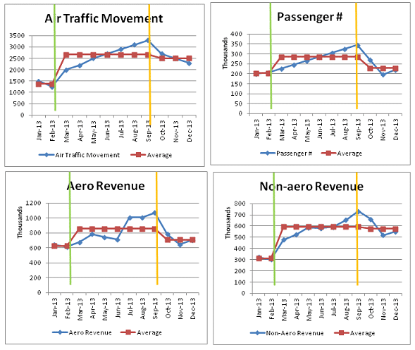
In the above dashboard measurement system, essentially, it is 4 Trend Charts. The differences are:
1. Any user, who is not aware of the decision dates and what decisions were implemented on those dates, can see the same here – as depicted by Green and Orange vertical lines, in each chart and as described above the charts
2. The trend is split into 3 parts i.e. pre first decision measurement system, period post first decision and period post second decision.
3. The user can also see the average pre and post each decision date, besides the trend (see the brown line in the charts)
4. What is more, user can compare the various KPIs with respect to the average before and after any decision implementation date. For example, in Passenger #, the average post Sept 2013 has reduced significantly, compared with Air Traffic Movement (no. of flights). Likewise, for Aero Revenue vs. Non-aero Revenue, there is a larger dip in values post the second decision implementation
In a nutshell, such a visualization, albeit simplistic, has the below advantages:
1. It gives different types of users knowledge of the major decisions taken and how the various KPIs get affected due to these decisions
2. Using the Average, one can simplistically compare pre and post each decision implementation dates
3. One can compare across KPIs, in the same visualization; both the above
One may argue that I have 10s of decisions and it will not be possible to show all the decisions in one trend chart. In that case, one may want to define which few decisions are major and which KPIs would get affected by each of these major decisions. One may have several KPIs trend as above, with the decisions vertical line being different for some KPIs than the other. The trick would be to identify which decisions’ impact needs to be seen on Trend of which KPI.
We will see more in a subsequent blog as to how other visualizations could be used for further enabling BI as a decision measurement system. Let us honestly ask ourselves, if this role of BI as a Decision Measurement System is something we would like to adopt for GrayMatter?